mandag 29. september 2014

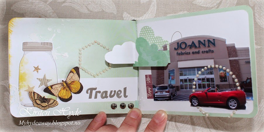
Project Life mini album - an art venture

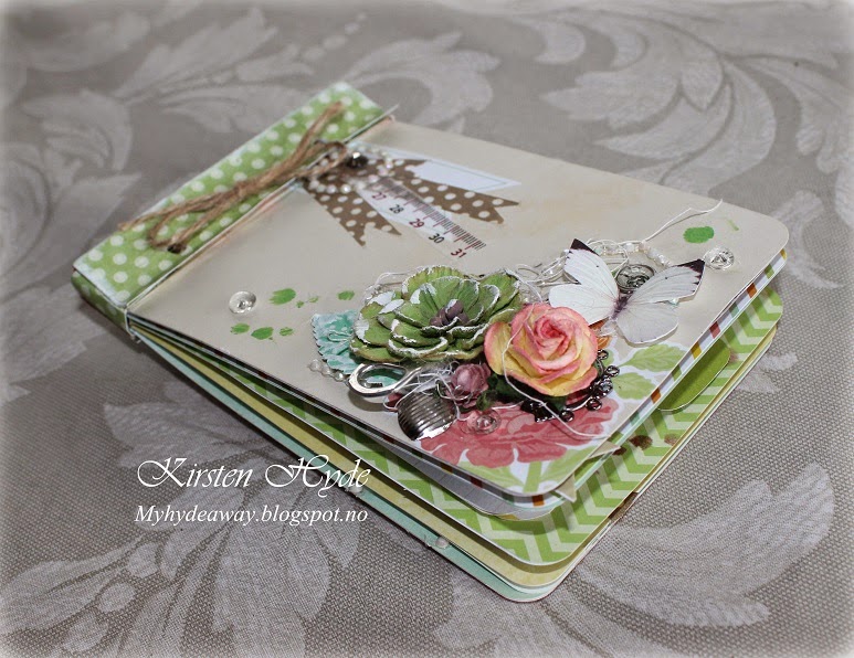
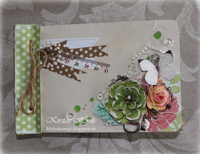
A week ago, there was a craft fair, Stempelscrap in Lillestrøm. This is the largest craft fair in Norway. This minialbum was made as a demo for Hobbykunst, for the fair. 

I do most kind of papercrafts, but I am not really into Project life. It was therefore a challenge to work with Project life. My idea is that the cards and kits can be used in many other ways than just creating Project life pages. 


This album, is very simple to make. Just collect some cards, make holes in one of the sides, and tie them together with a string. I have also used 3D tape between the pages, to create room for embellishment on the pages.


Washi tape is excellent embellishment for Project life pages. I have also used Prima embellishments and a butterfly from Kort og Godt.


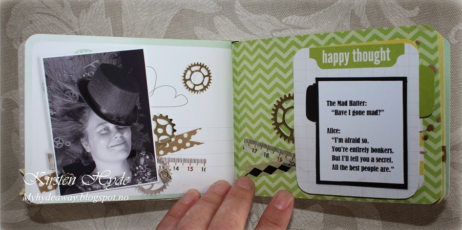
A lot of the creativity I do, includes stains, paint and glue. This is partly how my hands look at the end of the day. I have used the card as a frame for the photo, cutting out the frame, and gluing it onto the photo with 3D tape.


The steampunk photo was taken a few years ago. On the opposite side, I have folded one of the cards to make a another small page. 


I have used Gesso, a TH stencil and distress ink to create the background. The photo of me and my friend pops out of the page.


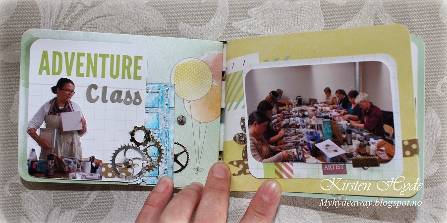
This is photos from one of my Mixed Media art classes. The metal has been coloured with Triton markers to test them on metal.


The clouds are made with a pop-up effect. The photo is from one of my trips to Jo-Ann this summer.


The back of the album


torsdag 25. september 2014

For your Mistle toes

Last weekend, I was doing a demo for Hobbykunst at Stempelscrap. I created a few examples to go with some of the products Hobbykunst had on their stand. I found the idea online. I think this would make a perfect little gift.


The paper is from Papirdesign - krakelert treverk. I have filled the bag with nail polish, a nail file, and a box of foot cream and "snow". 


This paper is from Papirdesign - låvevegg. The snowman is from Rayher. This bag could also have a gift card for foot treatment or a cozy pair of socks.


tirsdag 23. september 2014

Card with a Freia Chocolate Biscuit - Sjokoklem

We have a new challenge over at StampARTic. This time - the challenge is different card folds.


I have created a card with the Norwegian chocolate biscuit "Chocolate hug - Sjokoklem" from Freia. The card is partly made from an idea from the "tea light card" and partly from a card I saw a few years ago online in Ann Kristins blog.


The papers are Maja - Vintage Frost. The motive is an old do craft - Wellington - die cut. The little heart is a small gingerbread cookie cutter charm from Rayher. The two wooden stars, are also from Rayher. Both can be found at Hobbykunst.


I have distressed all the edges of the papers, and used gesso to get the white snow effect in the corners.


The inside of the card, with space for a message.


I have had several questions about how I decorate my cards at the back. Often I decorate the back very simple - but I still always decorate it.


The template for the card. Click to enlarge the image. Fold the tabs inside the circle down, and again the other way. The circle at the bottom fits on the tabs you have just folded. The rectangular strip is to cover flips at the inside of the circle - along the edge. Fold the tabs and sides of the box, and glue the box to the edge of the card. I have used a magnet inside the box, and some metal on the front of the card - to make a lock for the card.


I am entering these challenges:


fredag 19. september 2014

Mixed Media book cover for my Art Journal

This week, StampARTic is inspiring you to use old game pieces. I have created a Mixed Media book cover with some round game pieces.

Some time ago, I took a workshop with Andy Skinner. I have thought about using some of the skills from the class to develop my own work. I also wanted to create a cover for my Art Journal. So I decided to use some of the techniques on a mixed media cover.


I used a white sheet of paper and created effects of the crater in the paper with Molding Paste. The idea for "netting" effect in the paper is from Andy Skinners class. I have used Triton Acrylic markers with a paintbrush, and dry painted the colours on the top of the texture effect. A lot of the metal has also been painted with Triton markes - just to test them out - and YES they are brilliant!  I love the idea of having good paint for Mixed Media in a marker. I also love the idea, that it is water soluble before it has dried, but waterproof when it has dried.


I am entering these challenges:

torsdag 18. september 2014

Time is Precious - Art Journal Page

I have mad another page in my Art Journal.This is made after the Prima Build a Page sketch for September.


I have tested the Triton marker for the background and for the metal - and I must say I am really pleased with them.


The paper was first covered with Gesso, before colours and embellishment was added.


The blue colour is the Triton marker, where the colour is thinned with water.I have also used stamps and stencils to create the gray background effects.

The photo, is one I took last summer at the  Central Station in New York. I think I used about a minute shutter time.


I am entering these challenges:

mandag 15. september 2014

Enjoy the Journey - An Art Journal Venture...

Today, we have a new inspirational post at StampARTic. This time, the design team have created different Art Journals and created backgrounds. I have not made a lot of Art Journal, just because I have struggled to find my own way, creating the journal. Some time ago, I found Finnabair's Family Journal online, and this was entirely my kind of journaling. I like the style, and I also like the fact that there is a theme going on through the Journal. So I got a book, and decided to have a go, but do it my own way.


The photo is one I took in New York this summer. My aim is to use my own photos and add a few good quotes, as well as creating different backgrounds, and testing out new techniques, products and Mixed Media effects, in the Journal.


I have used strips of paper, glued them to the page and covered the page in Gesso. Then, I have added dylusions spray, distress ink and strips and blocks of coloured paper I have also used different kind of metal and stencils.


The doilie has been coloured with distress ink. 


This was the start of my book, and my Art / Mixed Media Journal venture. 


I am entering these challenges:

mandag 1. september 2014

Prima Autumn Mixed Media Layout

I have just started on the Design Team for Scandinavia paper fun. This is a Scandinavian challenge blog - with a new challenge every month. This month's challenge is Autumn. 


I have created a Prima Mixed Media Layout. The photo, is one I took in Key West last summer. There was something about the red petals from the Flame tree (Delonix regia), among the roots and stones that caught my eye. 


Papers are from Prima, Stationer's Desk Collection Kit. The stones are made from clay, and painted with different acrylic paints.


I have used dies from Marianne design to create the die cuts. The leaves have been made, using Nellie Snellen Floral Punch and embossing tool (Jumbo - Rose Leaf).  I have added diluted distress paint for effect.


I have also used cheesecloth, coloured with distress ink. I have also used building fiberglass strip tape on the background for effect.

I am entering these challenges:


Related Posts Plugin for WordPress, Blogger...